California Dining Room
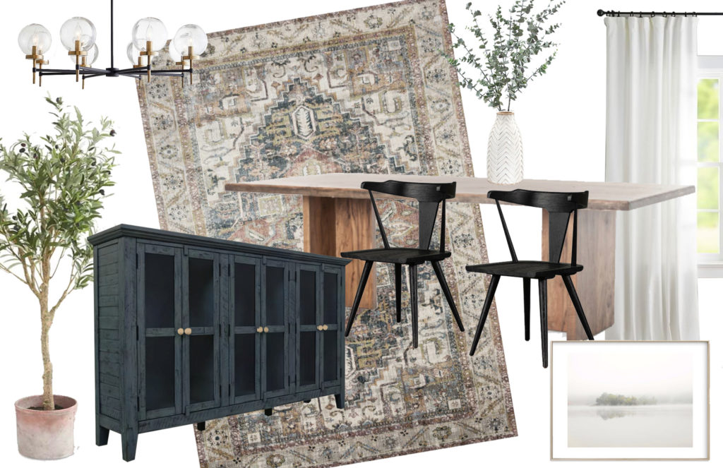
California Casual Dining Room Moodboard
This post contains affiliate links for your shopping convenience.
It's no secret that I'm a huge fan of relaxed, casual, modern farmhouse-meets-coastal design. In the past couple of years, this style has been given a name in the design world – California Casual. I'm working on updating a few rooms in our home, and I'm excited to share some of my mood boards with you all. Today, I'll be sharing my California Casual dining room moodboard. I'm also going to share my thought process behind choosing each element, so you can understand how I selected the pieces from a design standpoint. When I first started designing, it was really helpful for me to hear other designers talk about their decision making, and I hope it will help you with your decorating projects, too!

California Casual Style
The best way to describe California Casual style is modern, relaxed, and comfy with lots of natural and rustic elements, textures, and soft colors you would find in nature. I wanted my dining room to have neutral colors, natural wood elements, and a few modern touches sprinkled in. The reason I love this style so much is because it can feel casual enough for everyday living, yet sophisticated enough for more elegant entertaining. Our family is very casual. When friends and family come over, I want a house that looks nice (of course), but I also want it to feel relaxed enough for people to unwind and kick their feet up onto the furniture. That's what California Casual style is all about.
Design Inspiration
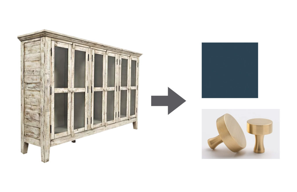
Every design should start with some kind of inspiration, whether it be a piece of artwork, a rug, a favorite chair, or a beautiful fabric pattern. Mine started with a piece of furniture. There is a rustic sideboard that we've had for several years now. While I'm perfectly fine with the overall design of it (not in love, but not offended by it either), I've never liked the color. It was kind of an order mishap, to be honest, and then I just didn't want to bother returning it. So, rather than discard perfectly good furniture, I've been dreaming about ways to give it a makeover, and change it into something fabulous! I know this is gonna sound strange, but when it comes to furniture makeovers, I like to let the furniture "tell" me what it wants to be. And this piece, kept saying "paint me a dark blue or green, and give me some brass knobs." So, that's what I'm going to do! I decided to paint it a beautiful deep, marine blue (Farrow & Ball's Hague Blue) and add some modern brass knobs.

The Table
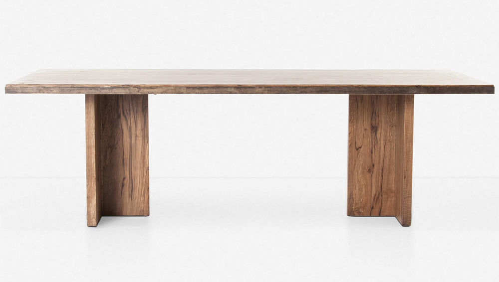
A blue sideboard, OK now what? The next decision (after my sideboard inspiration) was an easy one…a gorgeous wood table. You just can't go wrong with a classic wood dining table because it's timeless, and can work with many different styles. Not to mention…dark blue and wood tones are a match made in Heaven. The table I've shown on my dining room moodboard is made by a company called Four Hands. You can't buy from them unless you are a designer or dealer (sorry), but you can get their furniture from popular places like Crate & Barrel, Pottery Barn, and West Elm. You can get this particular table at Lulu and Georgia, and they call it the Ashbie Dining Table. I love this table's clean, modern lines coupled with a natural, medium-toned wood grain.

The Rug
Next, I needed a rug to tie the sideboard and table together. I found a gorgeous rug from one of my all-time favorite shops – it's the Kenley Rug from Lulu and Georgia. The colors are so perfect for this dining room, and it does the important job of both setting the style, and tying the colors together. I tried many different rugs on my dining room moodboard, and several worked well, but there was something just right about this one, when paired with all of the other elements.
Dining Chairs
To bring in more of a modern feel, I chose some curved black wood chairs that I've had my eye on for some time now. This is another Four Hands product, so you may be able to find them at several different stores. But, they just hit the floor at Pottery Barn as the Westan Dining Armchair. I have a little bit of a crush on black oak furniture right now…
Lighting, Artwork, and Accessories
Once I had the main furniture items and rug picked out, it was time to start pulling everything together with lighting, artwork, and accessories. This is the fun part for me, because the whole design starts to come together!
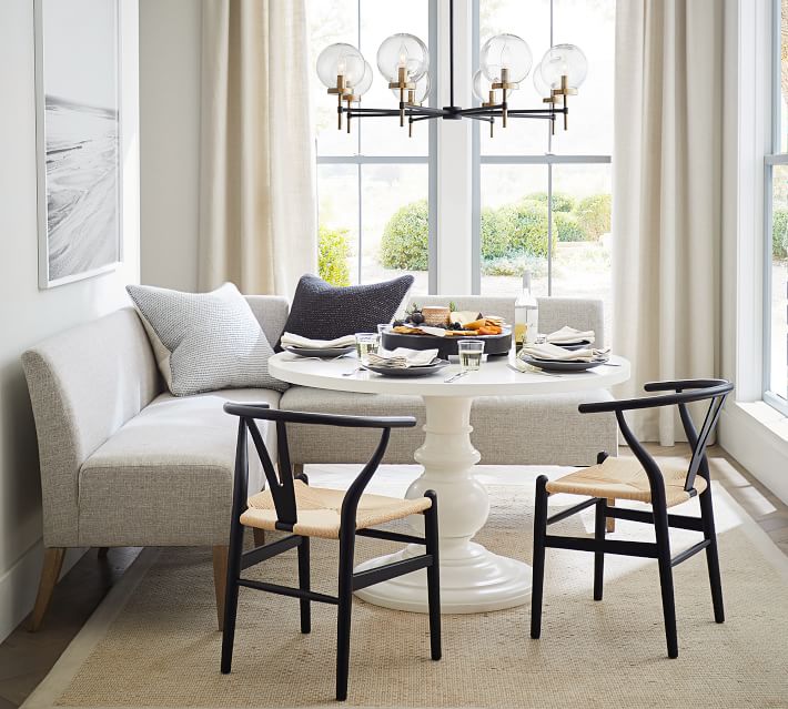
For the light fixture, I wanted something that would tie together the black chairs and the brass knobs of my sideboard. I also wanted it to have a bit of a mid-century feel. Why? Because the mid-century look can help tie together modern elements in a design with other less-modern styles (like coastal or farmhouse). I found a great light fixture at Pottery Barn that will look fantastic – the Camryn Round Glass Chandelier. There's actually another chandelier I'm lovin' on from Rejuvenation, and I think it will have to be a game-time decision…it happens!

Source: Pottery Barn
The artwork is a piece I've had my eye on for a while. It's called "The Island" by S.L. Bird, and you can get it on Minted (affiliate link). If you look closely, you'll see this particular piece used in a lot of designer and blogger's rooms these days – it's that popular! It is going somewhere in my house, no matter what (yes, I love it that much), and it seems to work well here in the dining room. I love the coastal vibe and the soft colors. It reminds me of a calm, crisp early morning on a lake, and I find it so soothing to look at. Couples don't always agree on artwork, but my hubby likes this one too, so it's a winner!
Every dining room needs a plant or small tree in the corner. See my post on the Power of Plants to understand why. The one in my dining room moodboard is just a cute little olive tree in a terracotta pot that I pulled from the internet. I don't have a specific plant selected yet, but one thing is for sure…it will be fake! Some designers are absolutely appalled by the idea of using fake plants, but I have a saying, "Faux Plants are Better Than No Plants." I kill plants (not on purpose, of course), and I know my limits. I can't be trusted with a real live tree in the house. When it comes to fake trees, I'm partial to the Nearly Naturals brand. Their 6 ft ficus is a designer staple! Pottery Barn also has a wide array of fake plants right now, but I have to tell you a little secret…some of them are just the Nearly Naturals brand in disguise, shhh.
Last, but not least, I adore the Adra Vase from Crate & Barrel. I've used it in a ton of coastal design boards for clients, and it's even bigger and more beautiful in person. Love the texture created by that chevron pattern! I'm planning to fill mine with faux (of course) eucalyptus branches, because they are perfect for coastal style (and so many other styles, as well).
I hope you've enjoyed seeing my dining room moodboard, and getting some insight into my design process. I'm super excited to see this room come together, and I'll be sure to post the end result when it's finished. Stay tuned for some more moodboards coming soon!
Related Posts
This site uses Akismet to reduce spam. Learn how your comment data is processed.
Title
Source: https://welshdesignstudio.com/california-casual-dining-room-moodboard/


0 Komentar